Spectragraphs As Tools: Part I
A spectragraph is a very powerful tool that is capable of showing us the energy levels present at various frequencies in a particular audio file over time. While they are not the ultimate arbiter of the fidelity of a particular track, they can quite easily inform those reviewing them about the frequency content and dynamic range of a selection. Let’s first take a look at the spectra of a couple of different compact discs…one that is heavily processed and one that is intended for the audiophile audience.
Standard Definition Spectragraphs
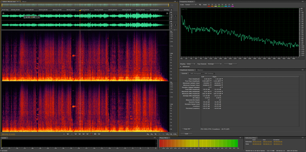
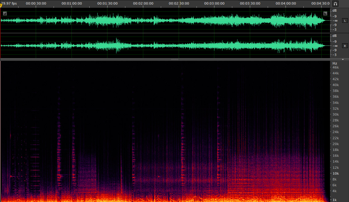
I use the spectragraph tools within Adobe’s Audition application. It is a very robust tool. Below is a typical example of a standard definition audio file, one that released on a standard compact disc. The track was taken from Sarah Evan’s “Stronger” CD release.
Typical spectra of a heavily mastered country pop tune – Sarah Evans – Anywhere
So what are we looking at and what can it tell us? The light green waveform display at the top of the graph shows the amplitude or volume of the left and right channels over time. The spectragraph on the lower portion of the graphic shows the same timeline but the y axis is now the frequency domain. The colors represent the amount of energy in the signal over time. The brighter areas (yellow and red) near the bottom are the loudest sounds in the lower part of the audible spectrum and the purple near the top shows the energy present in the higher frequencies. Notice that the highest possible frequency is just below 22 kHz, which is the maximum that a compact disc can accomplish given it’s half the sample rate (according to the Nyquist Theorem discussed elsewhere on the site).
Being that this is a country pop CD, there isn’t a lot of dynamic range or ultra sonics. This is what we would expect. Tunes like this one are promoted on the radio, which demands that they sound as loud as the rest of the tracks played. The limits on ultra sonics are the result of sample rate associated with the Redbook CD specification. The overall sound is pretty typical of today’s music. There just isn’t a lot of musical subtlety in tracks produced for commercial CD release and airplay on the radio.
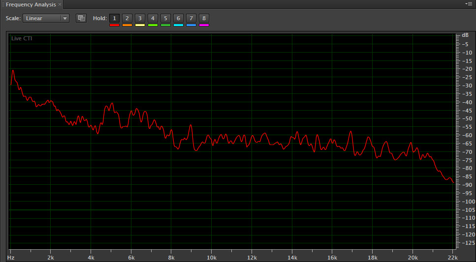
Another way to display the frequency content of a track without regard to time is to plot a graph showing frequency content on the x axis and amplitude on the y axis of a graph. Audition can produce graphs of this sort as well. Here’s the same Sarah Evans tune as a frequency analysis:
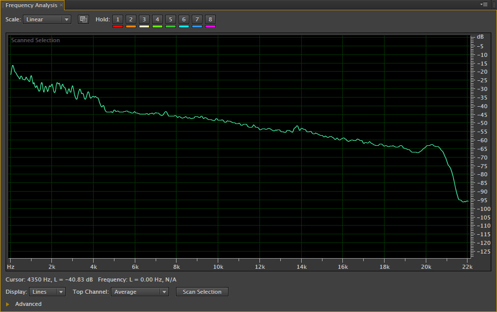
This plot shows the distribution of frequencies present in the song. Notice the rolloff filter used at the very high end.
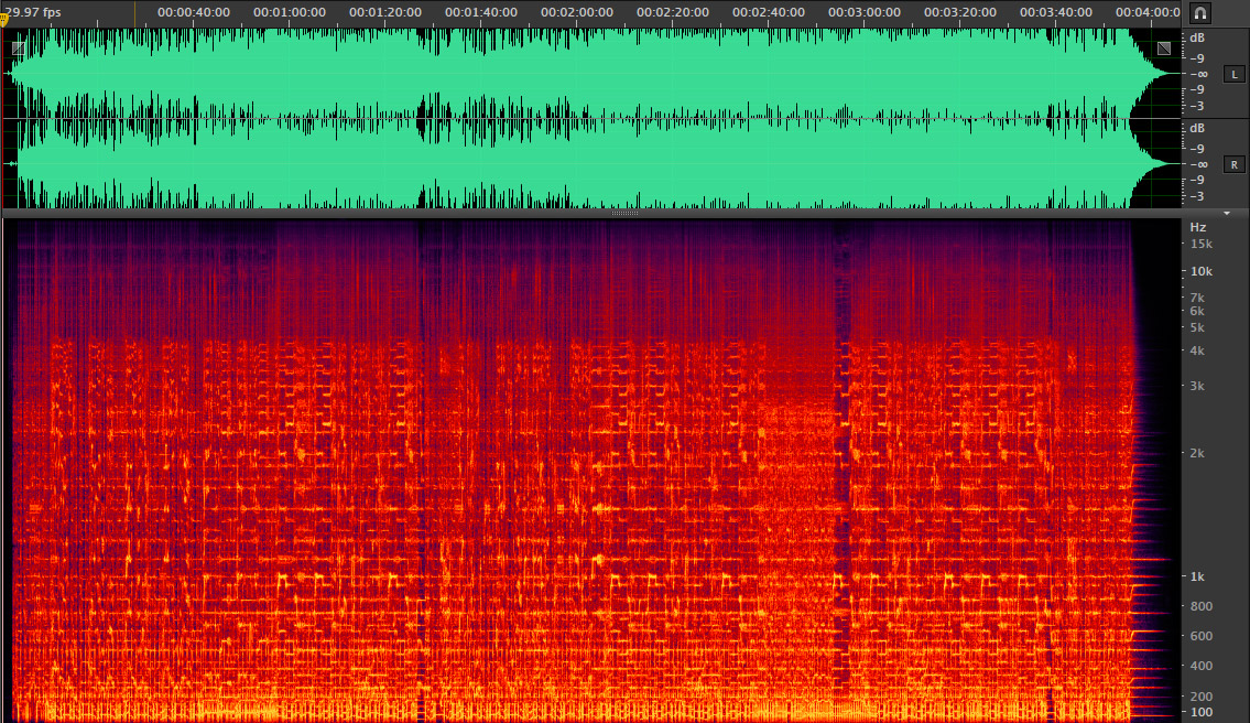
Now let’s take a look at the spectra of an audiophile CD. This track was taken from a 2005 sampler by Chesky Records.
Spectragraph of a Chesky Records track from 2005.
And here’s the frequency analysis:
Frequency analysis of the same CD track from the Chesky sampler.
It looks dramatically different than the graphs presented above. The light green waveforms are not “topped” off, which is sign of aggressive dynamics compression and limiting. In addition, the spectra shows a real world distribution of frequencies rather than the high end hyped version in the country pop tune. Both tracks display the same scaling and ranges. The Chesky track is going to be much quieter than the Sarah Evans track as we would expect. But the Chesky track appropriately reproduces the timbral components of the instruments of the ensemble. Neither one of these tracks is a high definition track, but one is clearly more appealing to audiophiles.
High Definition Spectragraphs
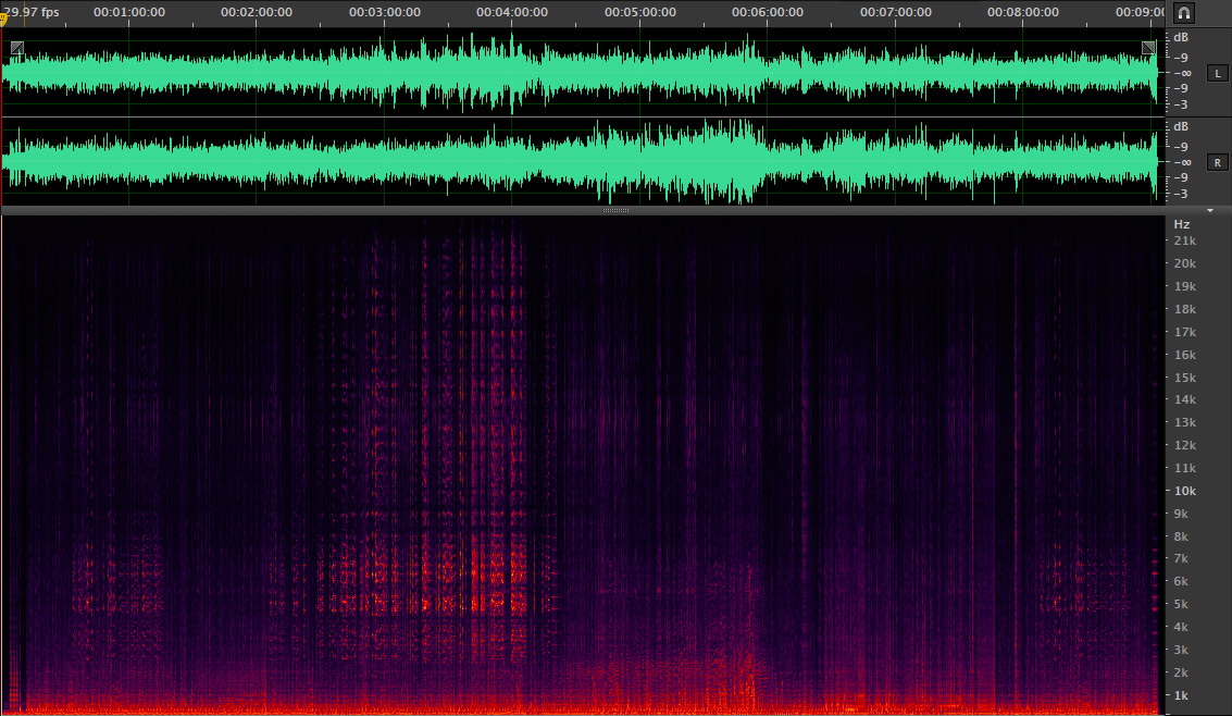
Finally before closing this introductory post on spectragraphs, let me show you a bona fide HD-Audio recording from AIX Records. Here’ the spectra graph of a tune called “Mujaka” from The Latin Jazz Trio featuring Luis Conte, David Garfield and the late Dave Carpenter.
Frequency analysis of a real HD-Audio track. Notice the additional octave of frequency range and the uncompressed nature of the waveforms.
This plot illustrates that a musical performance can contain frequencies that exceed the traditional 20 kHz upper limit of human hearing. While it may be okay for many audiophiles to ignore the next highest octave, wouldn’t be nice to know that everything that was produced by the musicians and singers was captured and delivered on the final distributed disc or soundfile?